7. Visualization
How to View Your Plots - (1/3)
- From a Python script:
Useplt.show()at the end to display figures.
pltis fromimport matplotlib.pyplot as plt plt.plot(x,y)for x and y axis

How to View Your Plots - (1/3)
How to View Your Plots - (3/3)
- From a Jupyter (IPython) notebook:
Use%matplotlib inlinefor static images or
%matplotlib notebookfor interactive plots
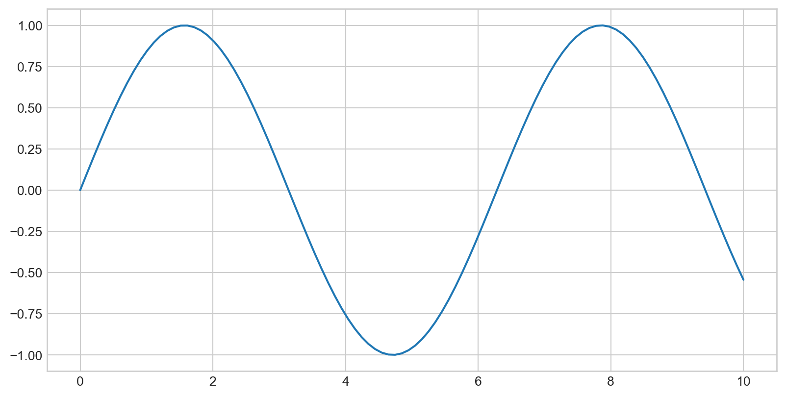
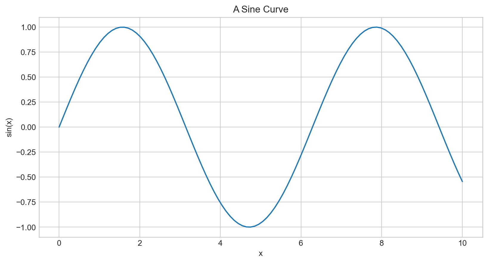
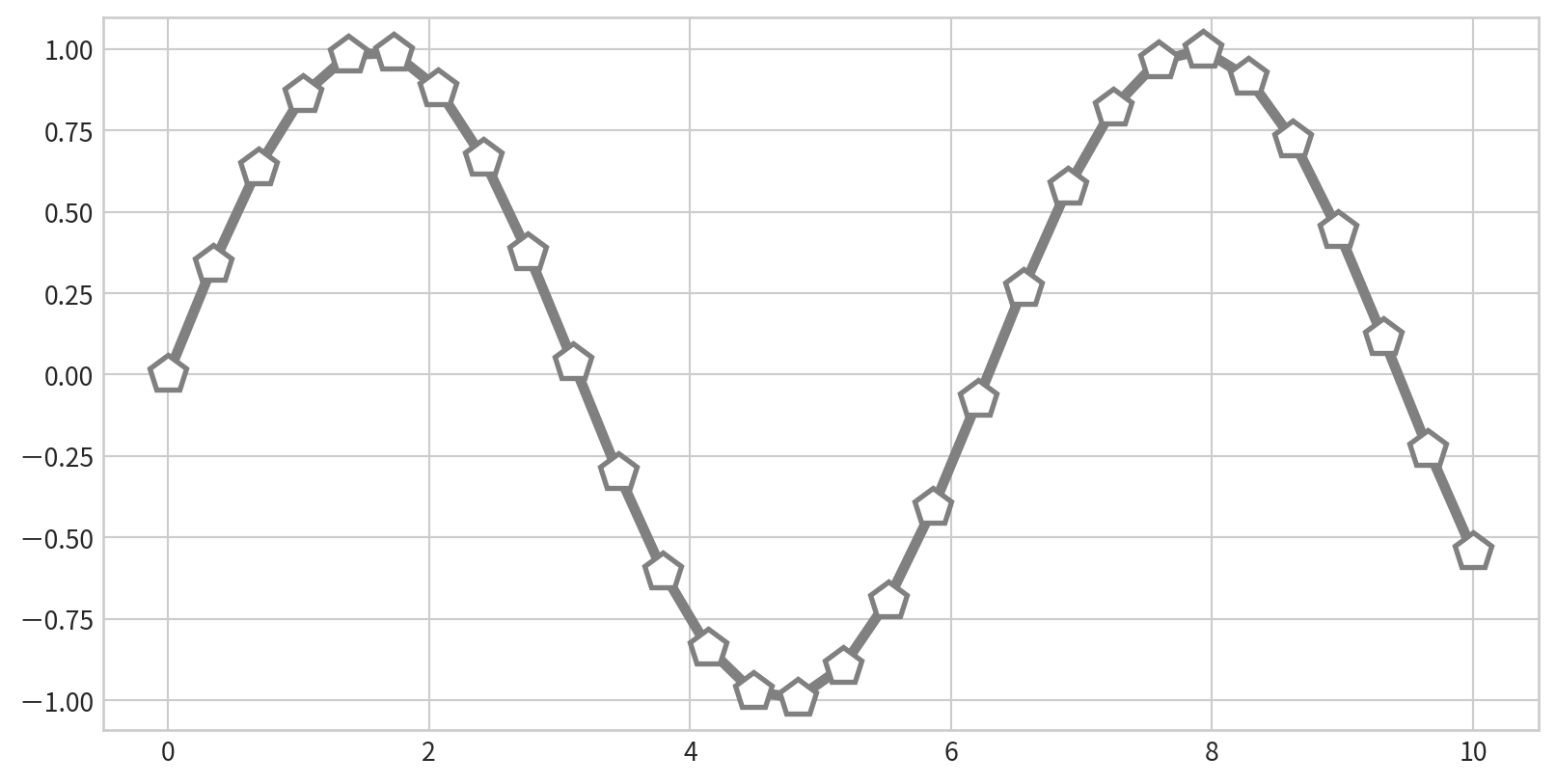
Plotting a Simple Function
Plotting a sine curve with plt.plot(x,y), plt is from import matplotlib.pyplot as plt

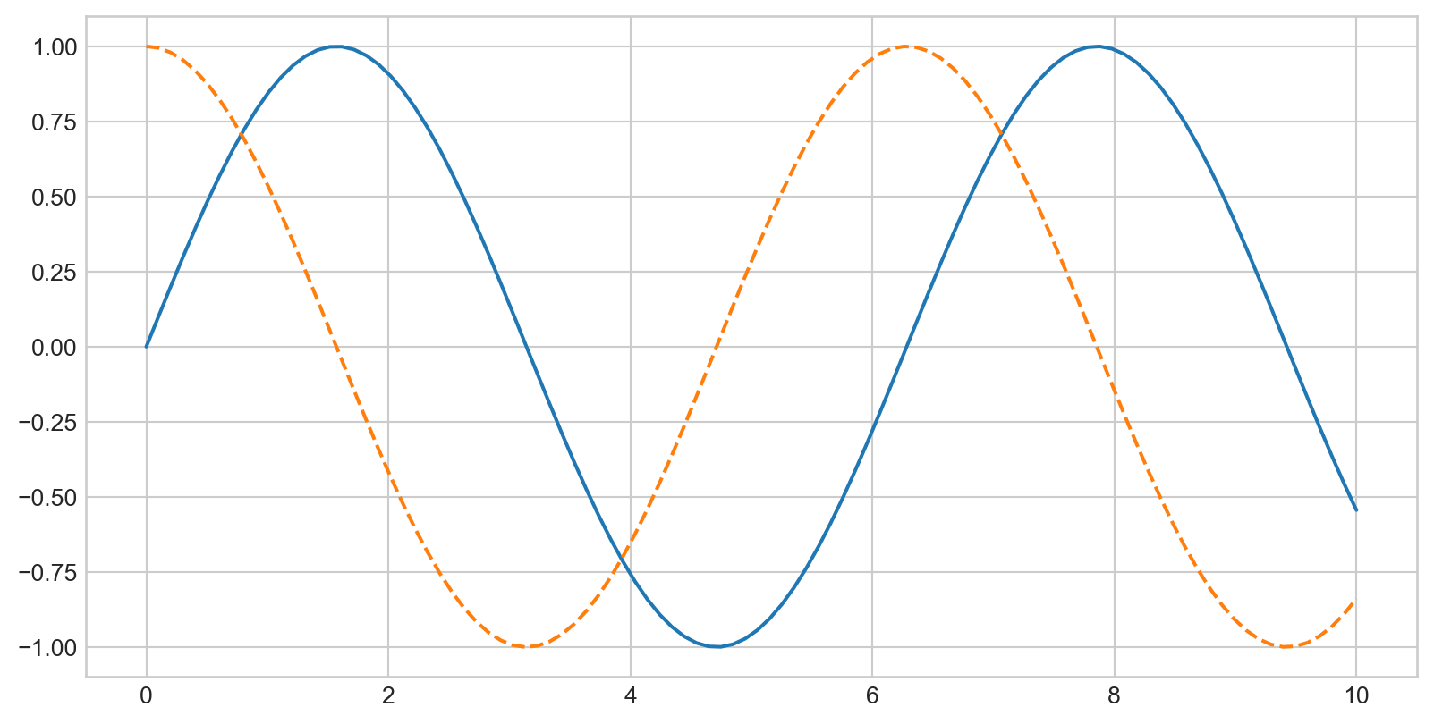
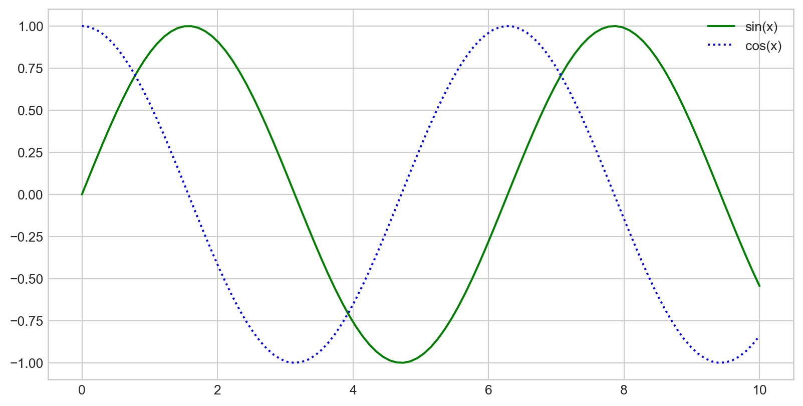
Multiple Lines in One Plot
Call plt.plot multiple times to overlay lines:
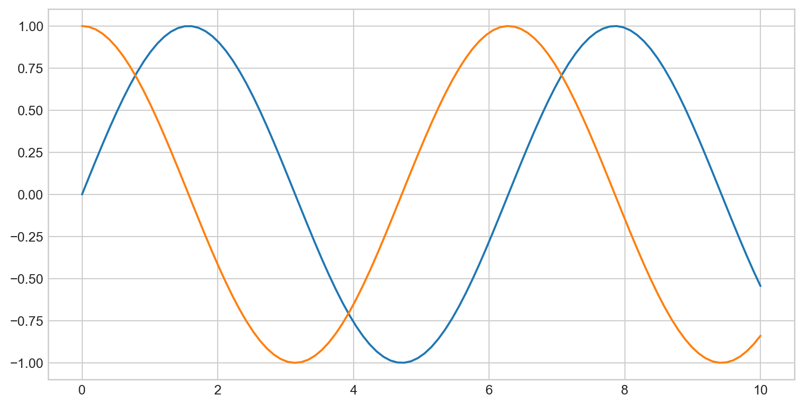
Customizing Line Color
plt.plot() with color parameter
plt.plot(x, np.sin(x - 0), color='blue')        # by name
plt.plot(x, np.sin(x - 1), color='g')           # short code (r, g, b, c, m, y, k)
plt.plot(x, np.sin(x - 2), color='0.75')        # grayscale
plt.plot(x, np.sin(x - 3), color='#FFDD44')     # hex code
plt.plot(x, np.sin(x - 4), color=(1.0,0.2,0.3)) # RGB tuple
plt.plot(x, np.sin(x - 5), color='chartreuse')  # HTML color name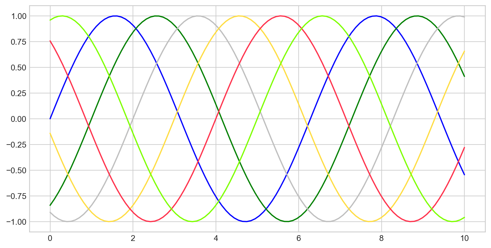
Customizing Line Style
plt.plot() with linestyle parameter
plt.plot(x, x + 0, linestyle='solid')
plt.plot(x, x + 1, linestyle='dashed')
plt.plot(x, x + 2, linestyle='dashdot')
plt.plot(x, x + 3, linestyle='dotted')
# Short codes:
plt.plot(x, x + 4, linestyle='-')   # solid
plt.plot(x, x + 5, linestyle='--')  # dashed
plt.plot(x, x + 6, linestyle='-.')  # dashdot
plt.plot(x, x + 7, linestyle=':')   # dotted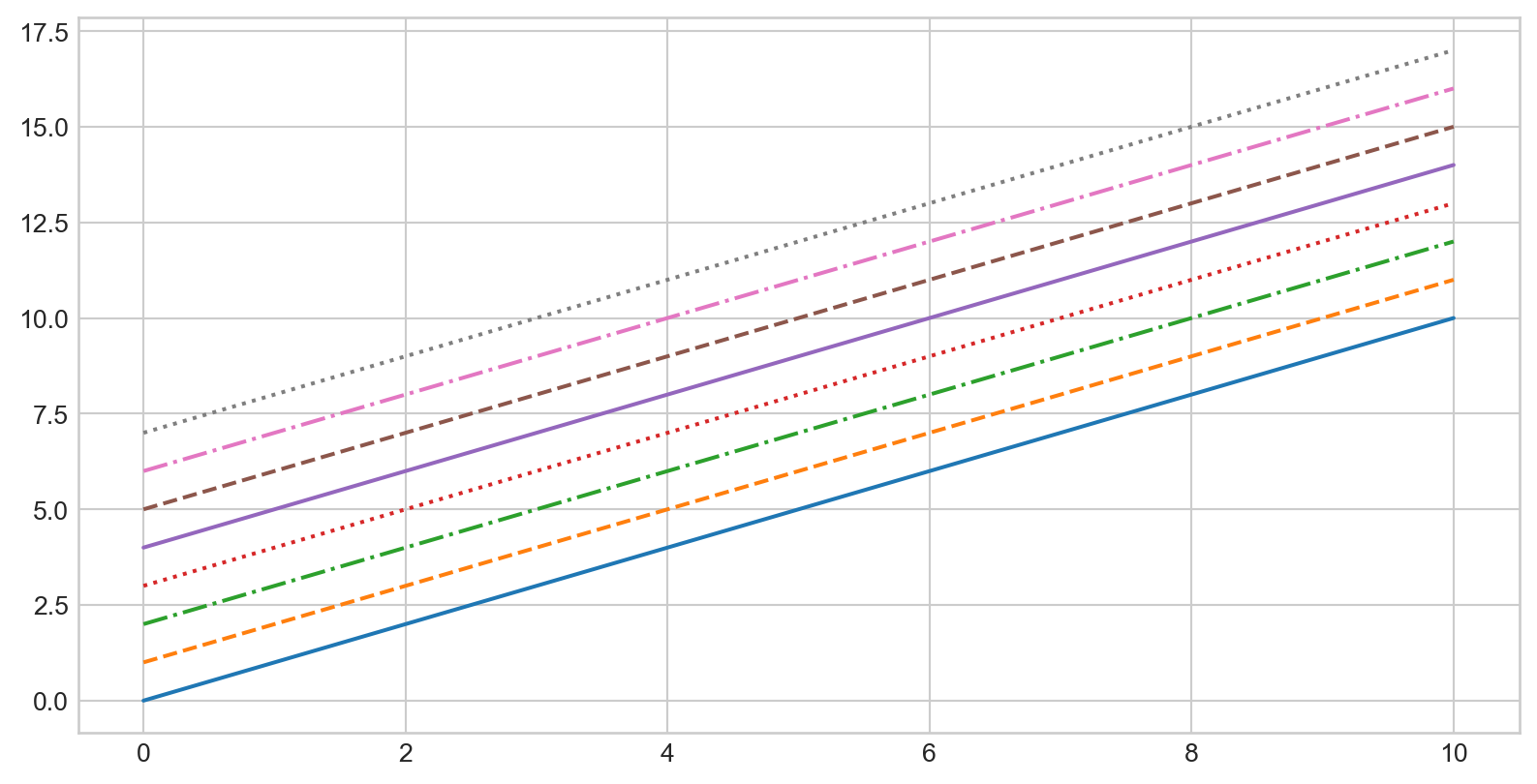
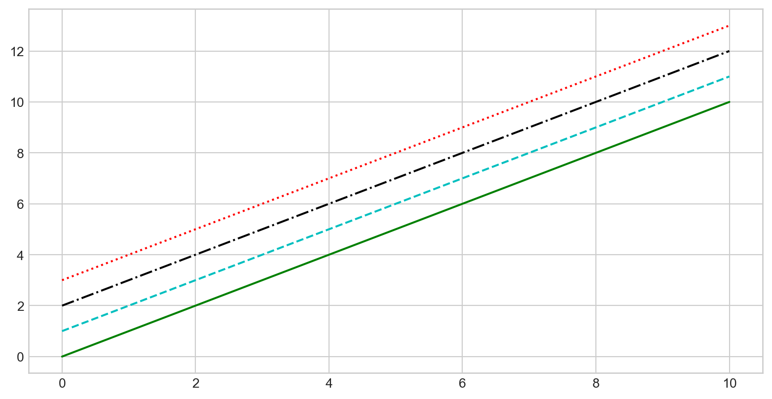
Customizing Line Color and Style
Adjusting Axes Limits
plt.axis([xmin, xmax, ymin, ymax]), limits are arranged into a list
Adding Titles, Labels, and Legends
plt.title(), plt.xlabel(), plt.ylabel()
Adding Titles, Labels, and Legends
Add a legend for multiple lines with plt.plot() + label parameter and call plt.legend()
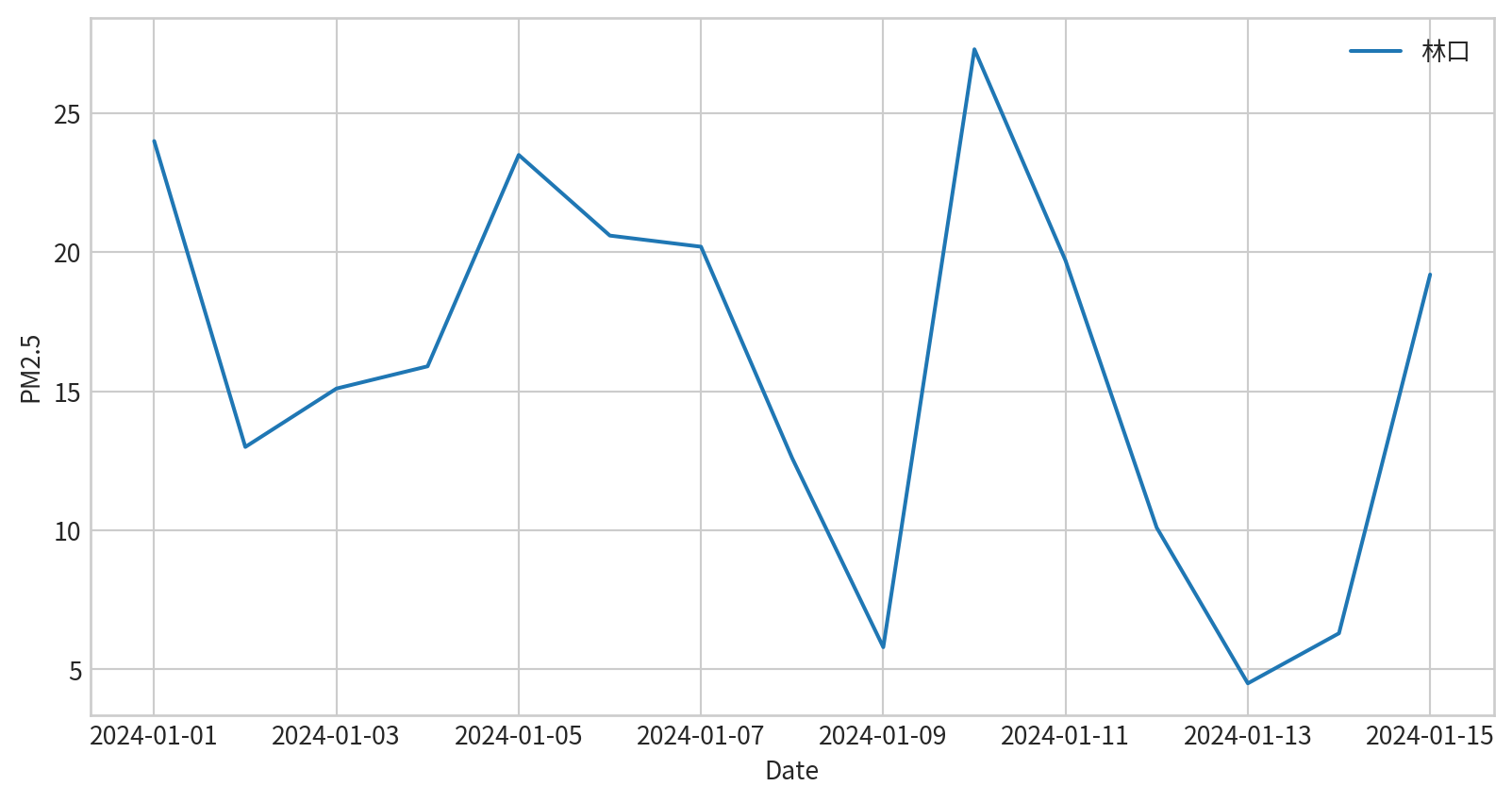
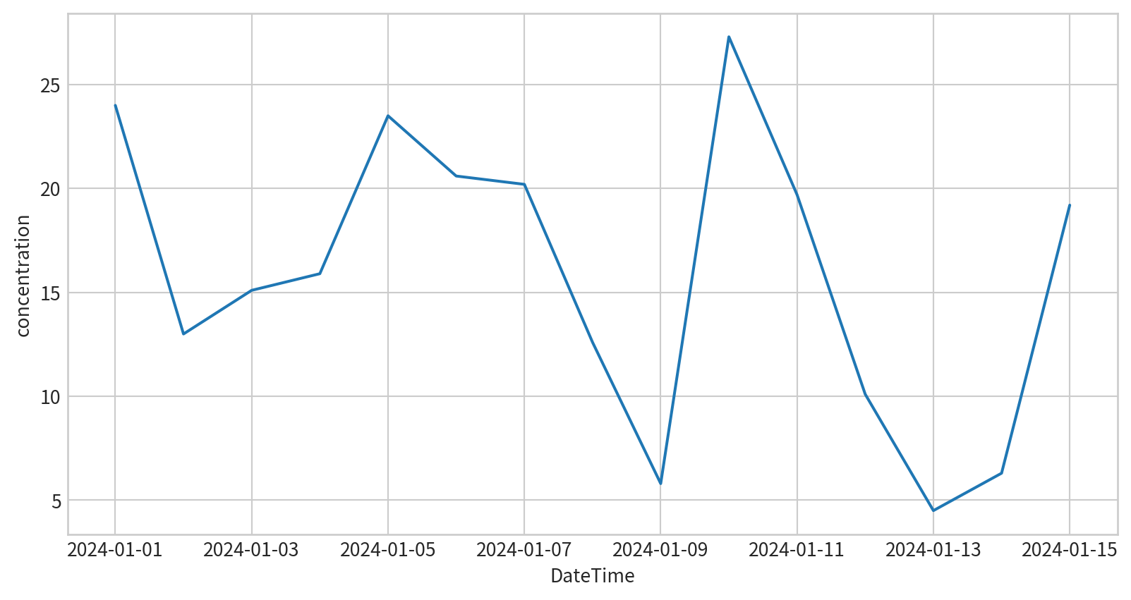
Hands-on - Line Plot
請試著呈現林口測站在2024/1/1~2024/1/15的PM2.5濃度,要呈現figure legend,也要呈現x y 軸的名字
Ref:
Line Plot - Seaborn
sns.lineplot(x,y), x and y are data for each axis

Line Plot - Seaborn
sns.lineplot(data, x, y), x and y are column names for each axis
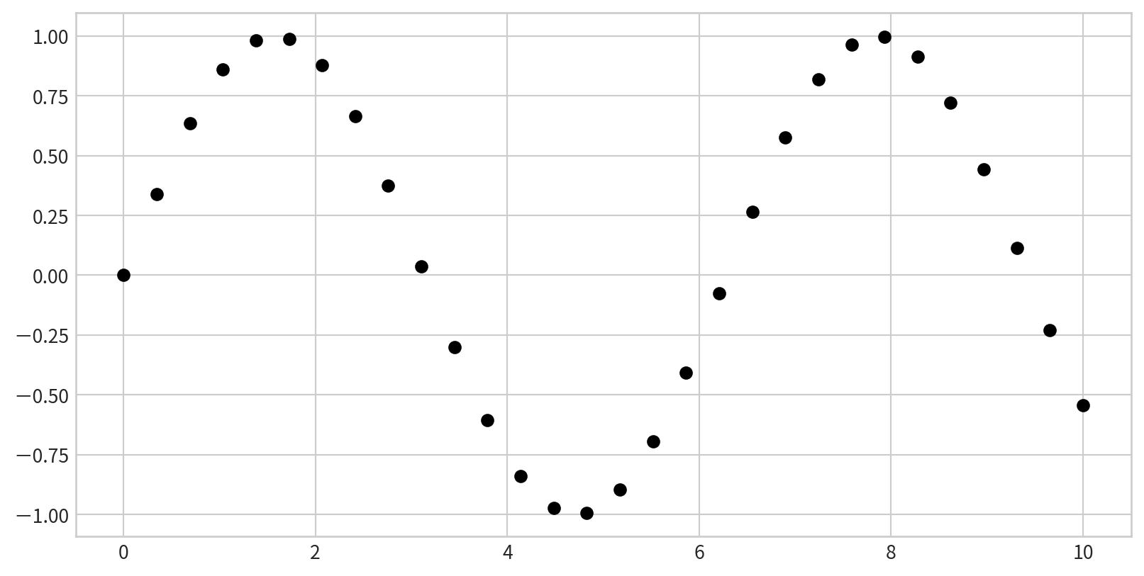
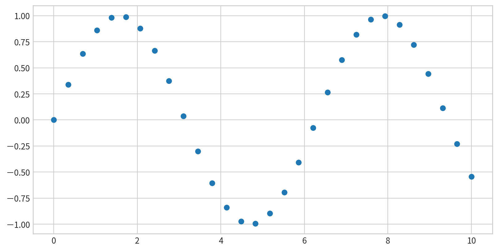
Scatter Plots with plt.plot()
plt.plot(x,y,marker,color), marker for shapes, color for color
Scatter Plots - marker shape
'o', '.', ',', 'x', '+', 'v', '^', '', 's', 'd' …
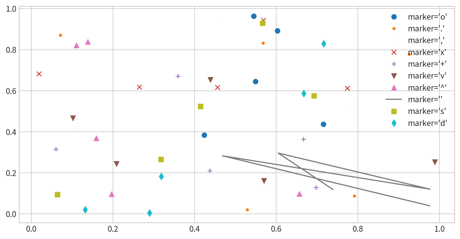
Line styles and marker shape
Combine marker and line styles for more complex plots

Line styles and marker shape
Customize markers and lines with additional arguments
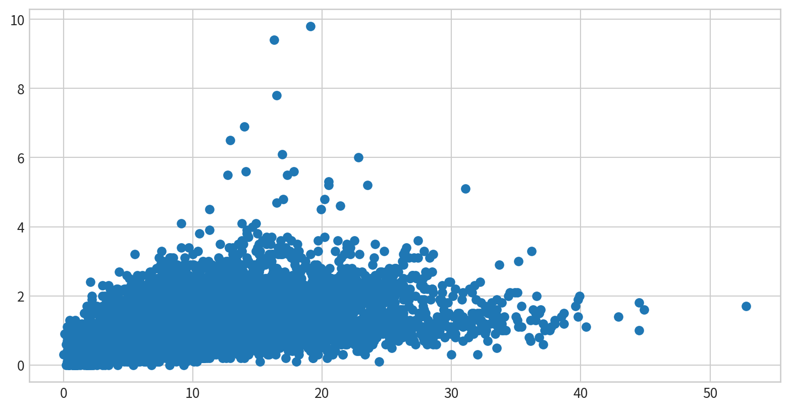
Scatter Plots with plt.scatter
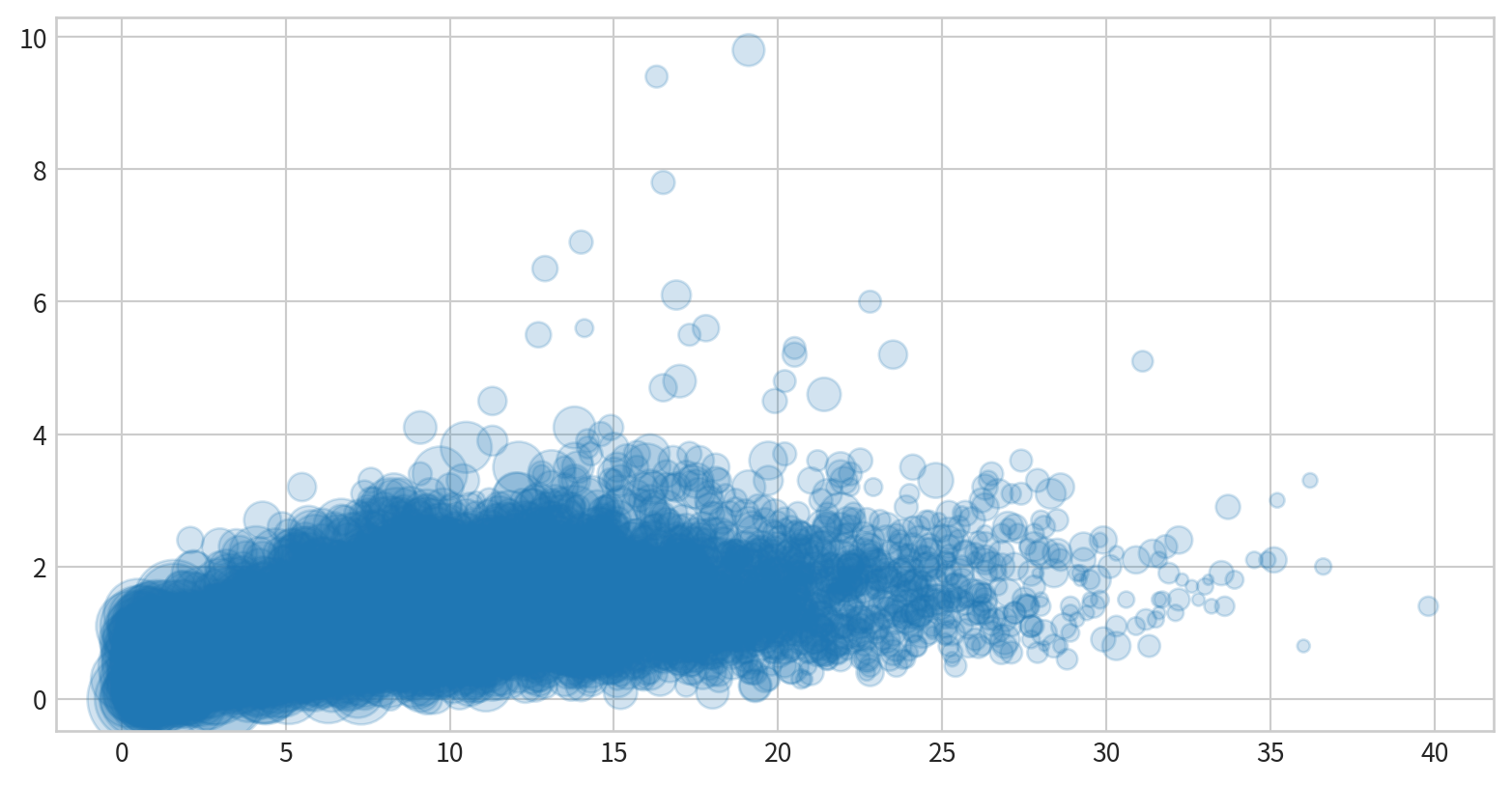
plt.scatter(x, y) allowing individual control over each point’s size, color, and other properties.
with varying color and size - Bubble chart
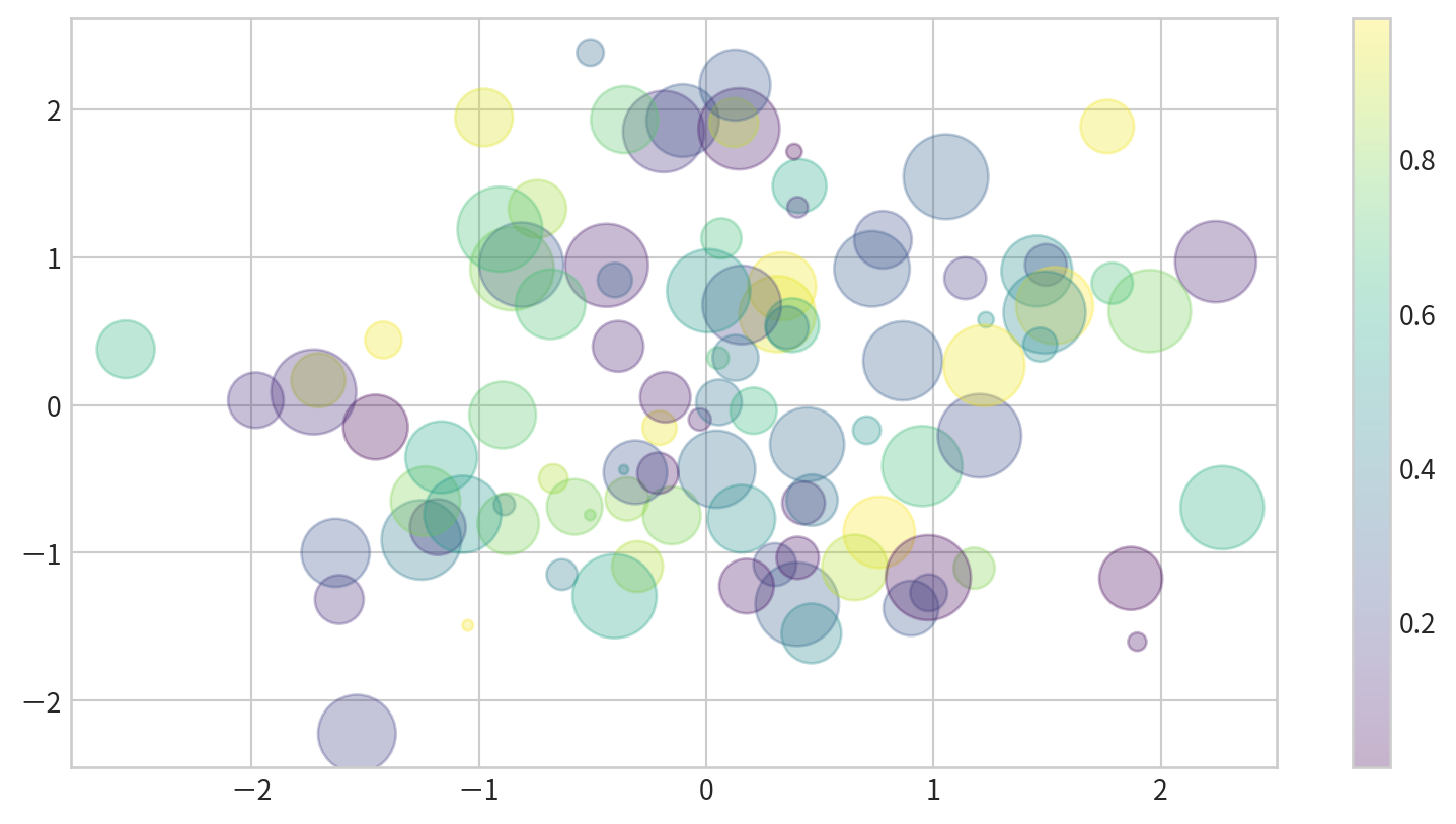
Visualizing Multidimensional Data
x/y positions, size, and color all encode different data dimensions.

Visualizing Multidimensional Data
Text(0, 0.5, 'sepal width (cm)')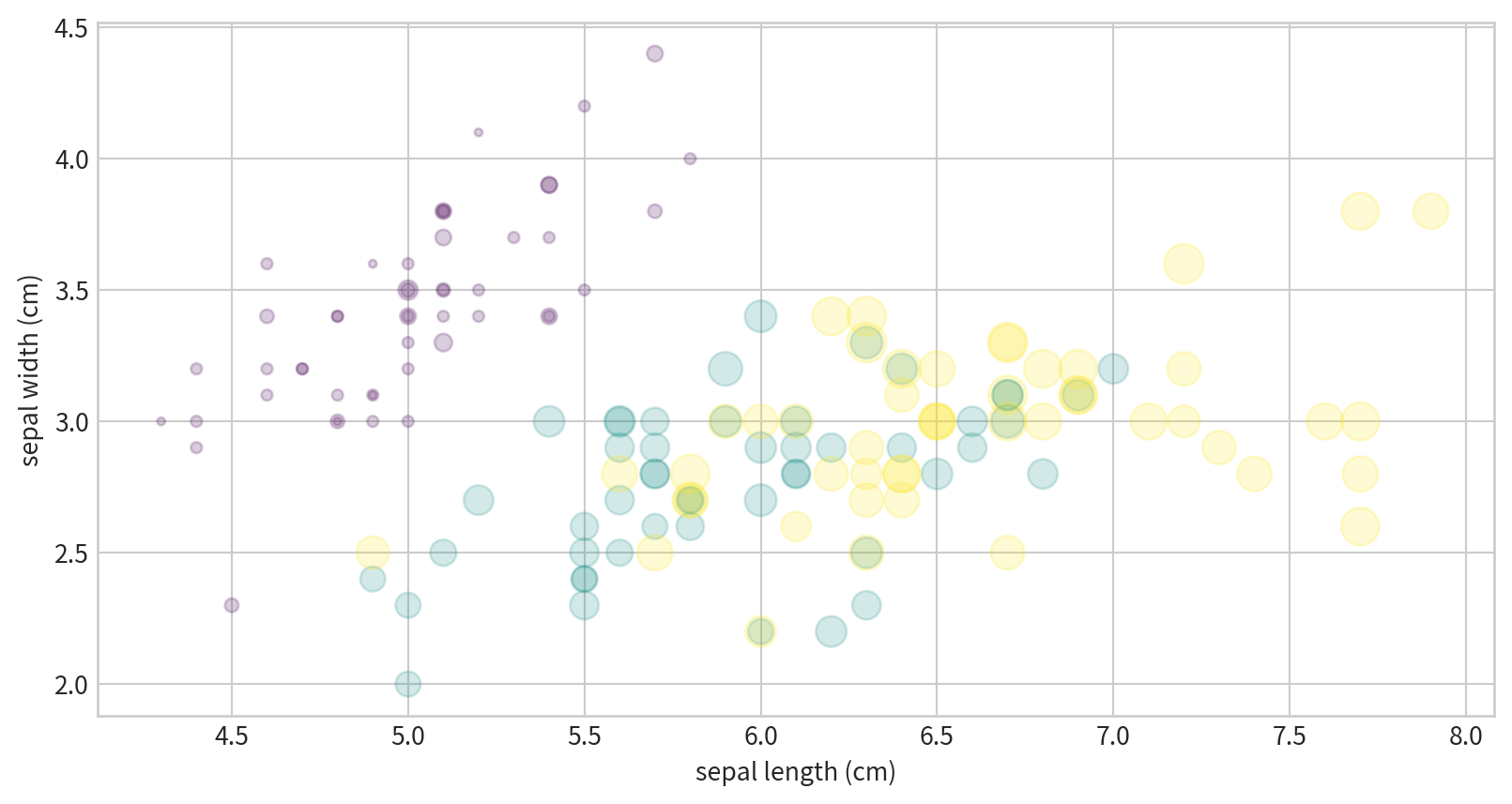
Hands-on - Scatter Plot
試著看看空氣污染資料中,NO2濃度與SO2濃度有沒有相關?
Hint: multiple records on the same date - df.groupby()
Ref:
Hands-on - Scatter Plot
使用泡泡圖呈現NO2與SO2的關係,並用風速(WIND_SPEED)當作泡泡大小,觀察這些資料是否有相關
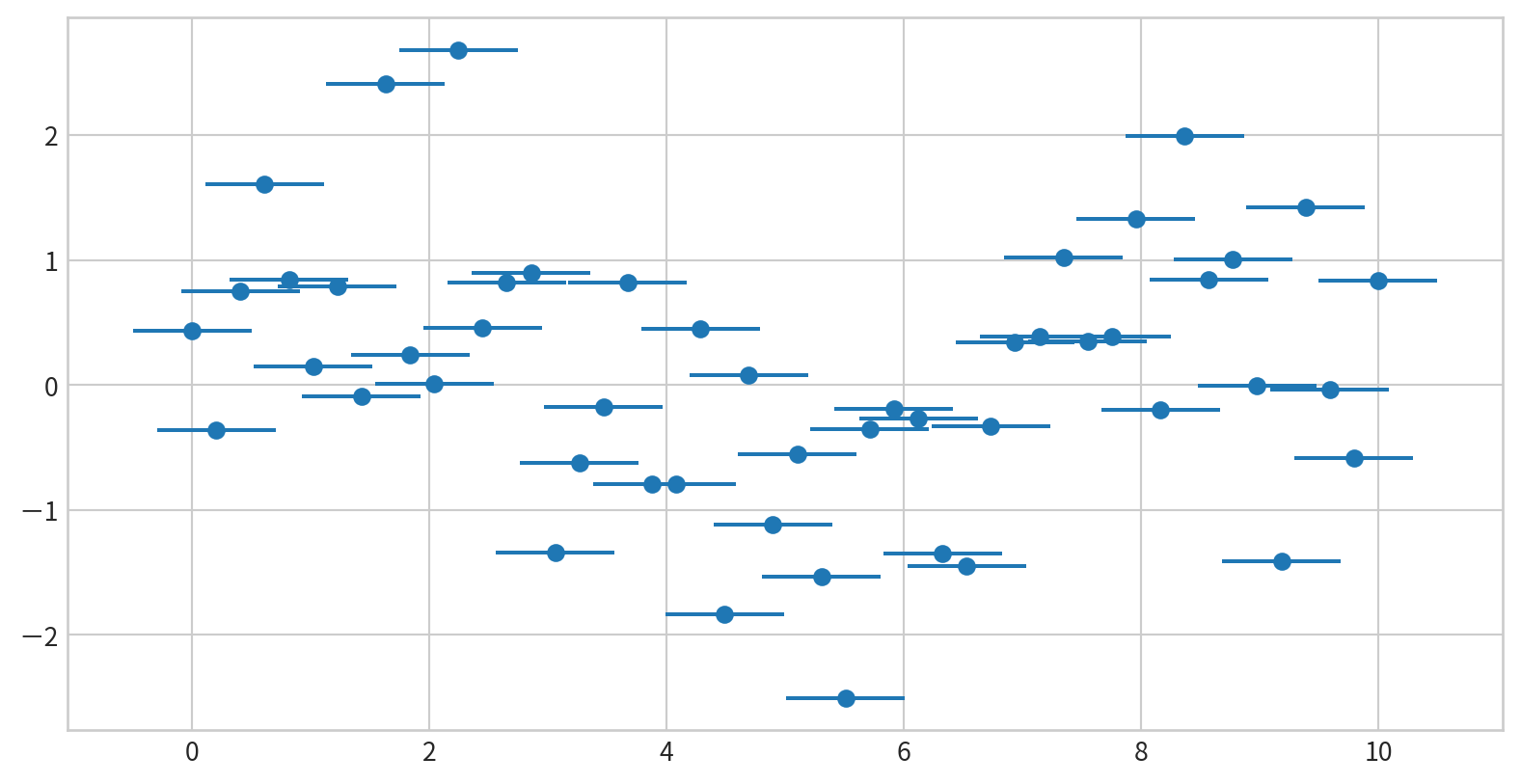
Basic Error Bars with plt.errorbar
Plot: plt.errorbar(x, y, yerr=error size, fmt = style)
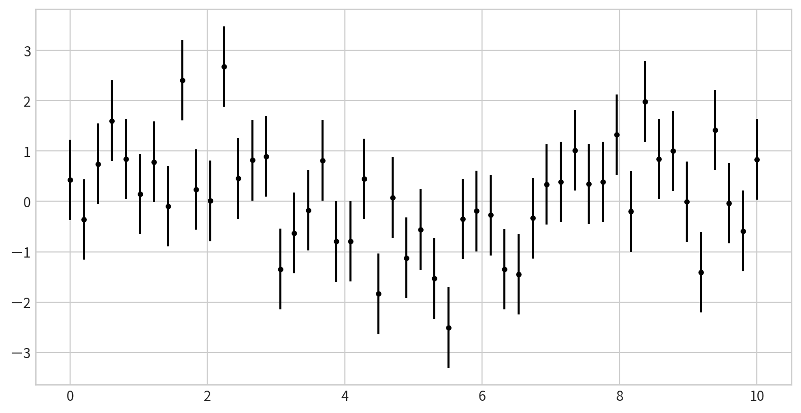
Customizing Error Bars

Horizontal and One-Sided Error Bars
Add horizontal error bars using xerr in plt.errorbar()
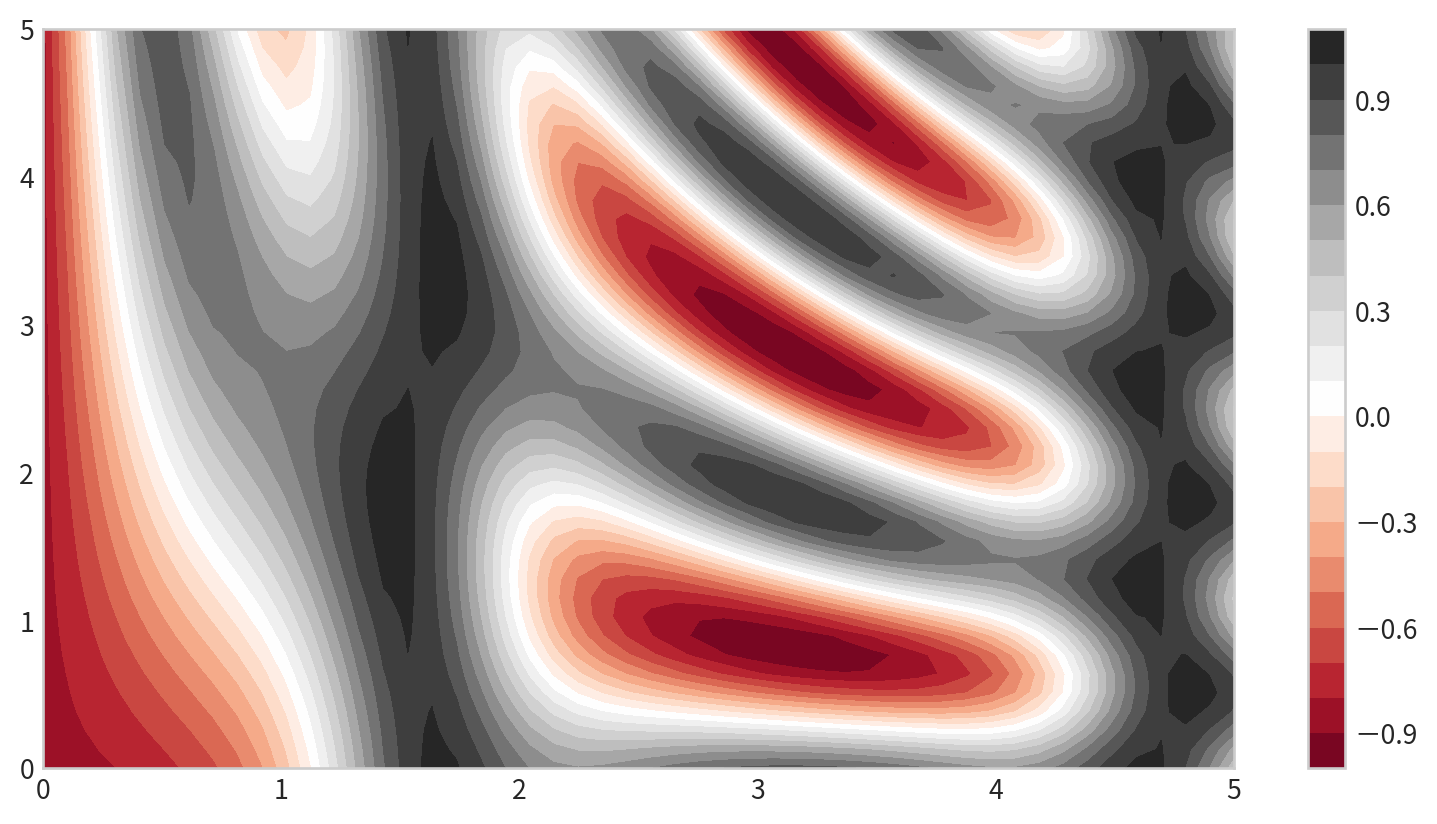
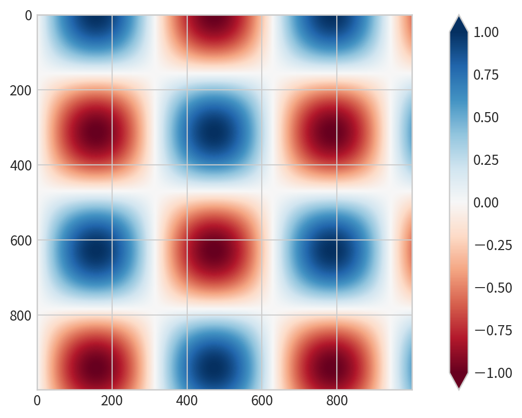
Basic contour plot
plt.contour(X, Y, Z, colors)
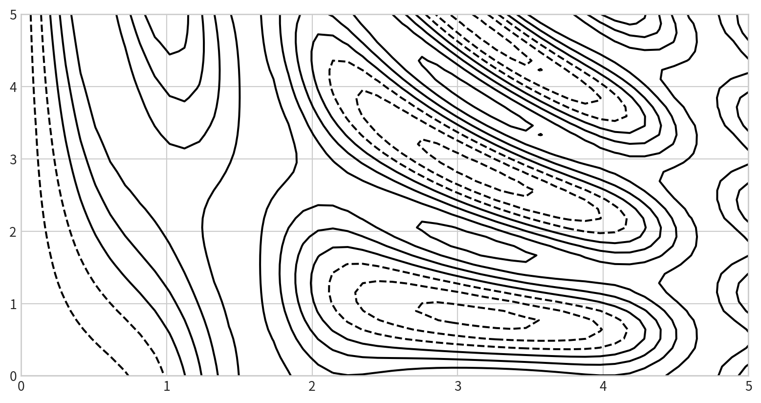
Negative values are dashed lines, positive values are solid lines
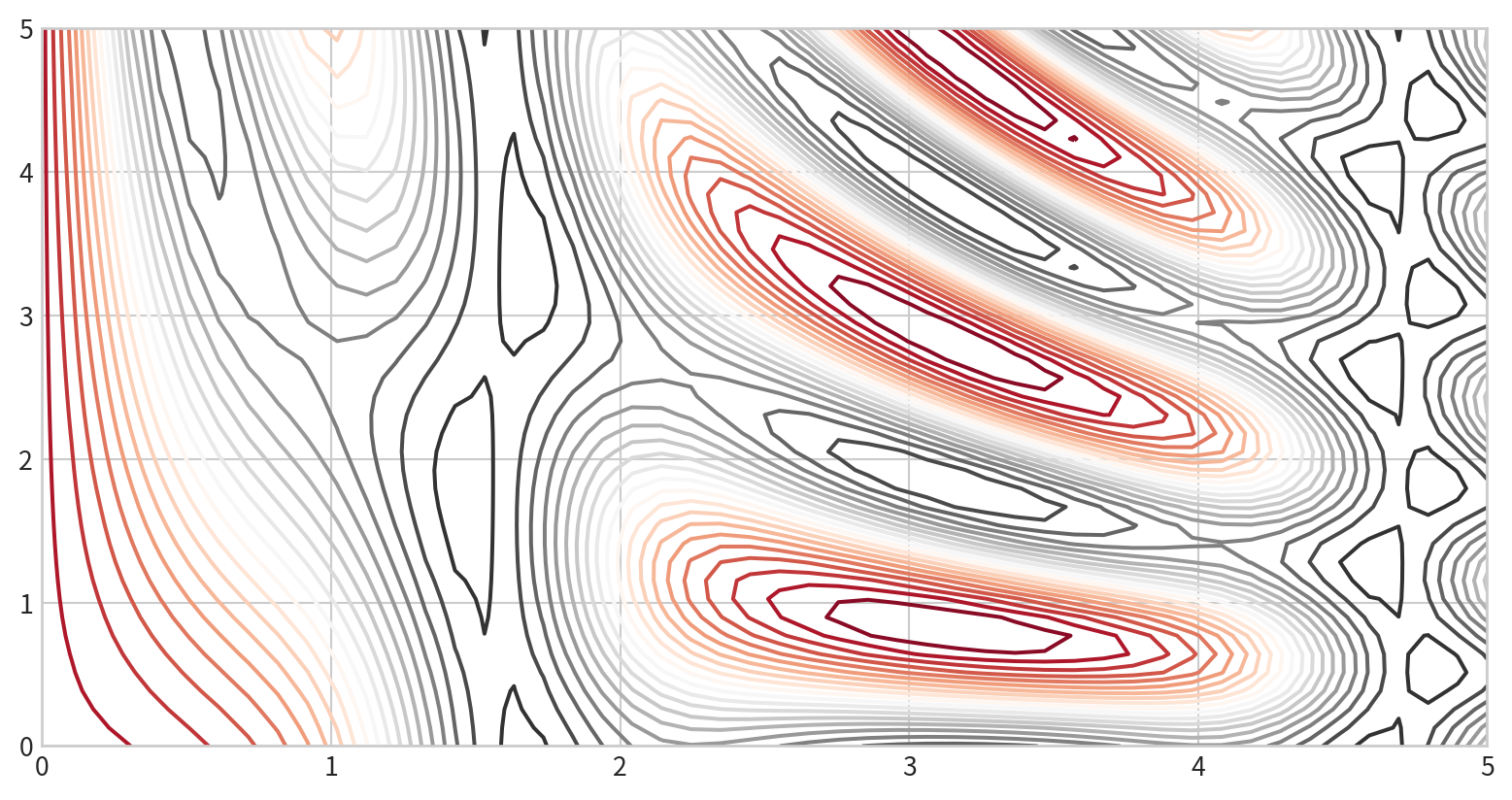
Color-Coded Contour Plot
cmap: to specify a colormap- set the number of contour levels
20
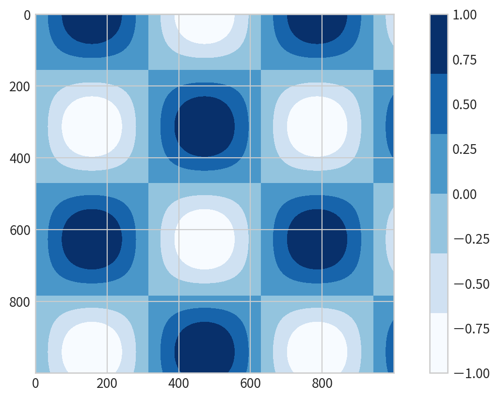
Filled Contour Plot
plt.contourf()for filled contours- add a colorbar
plt.colorbar()for reference:
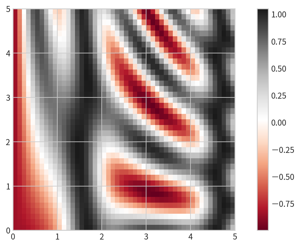
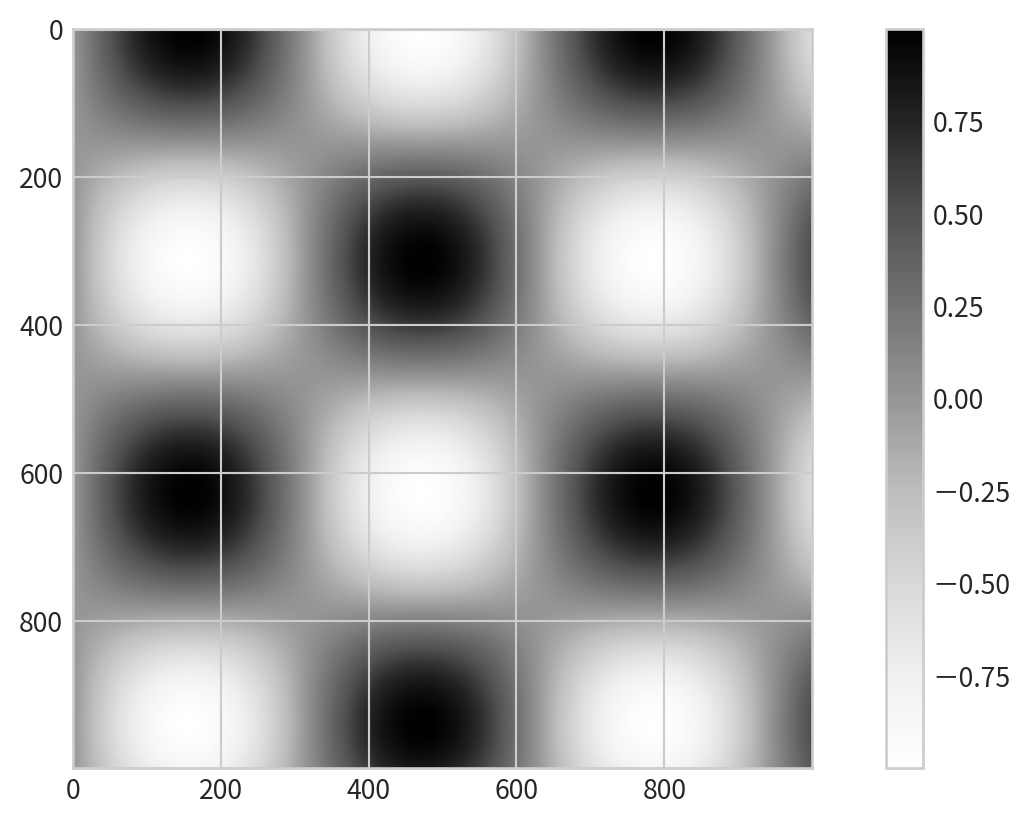
Displaying Data as an Image
plt.imshowto display the grid as an image- does not accept x and y grids; set
extentmanually. - The default origin for
imshowis the upper left; setorigin='lower'for consistency with contour plots.
- does not accept x and y grids; set
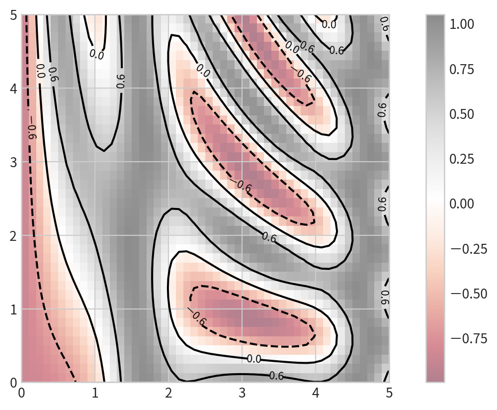
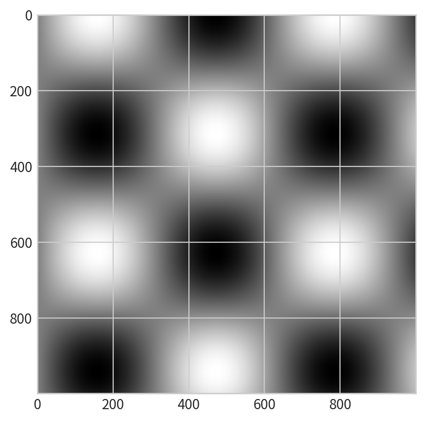
Combining Contour and Image Plots
Overlay contours on an image for richer visualization: plt.clabel()- label contour lines
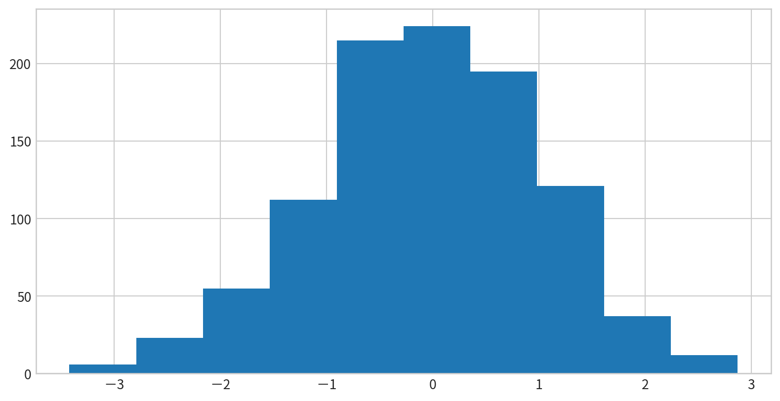
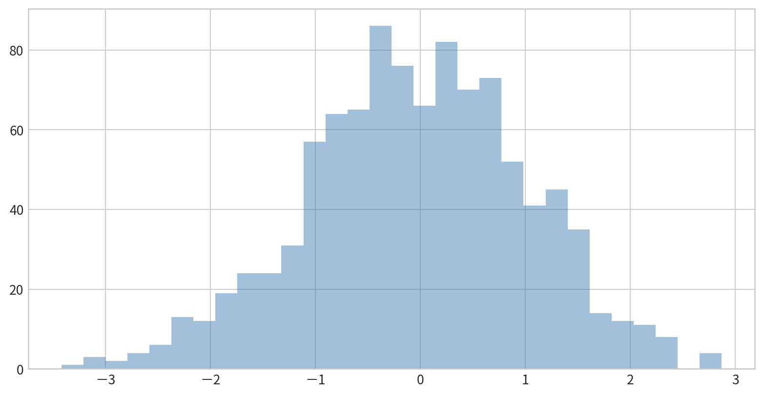
Creating a Simple Histogram
plt.hist(data) displays the distribution of data in default bins
Customizing Histograms
Options to control calculation and display:
bins: Number of binsalpha: Transparencyhisttype: Type of histogram (e.g.,'stepfilled')color,edgecolor: Color settings

Customizing Histograms
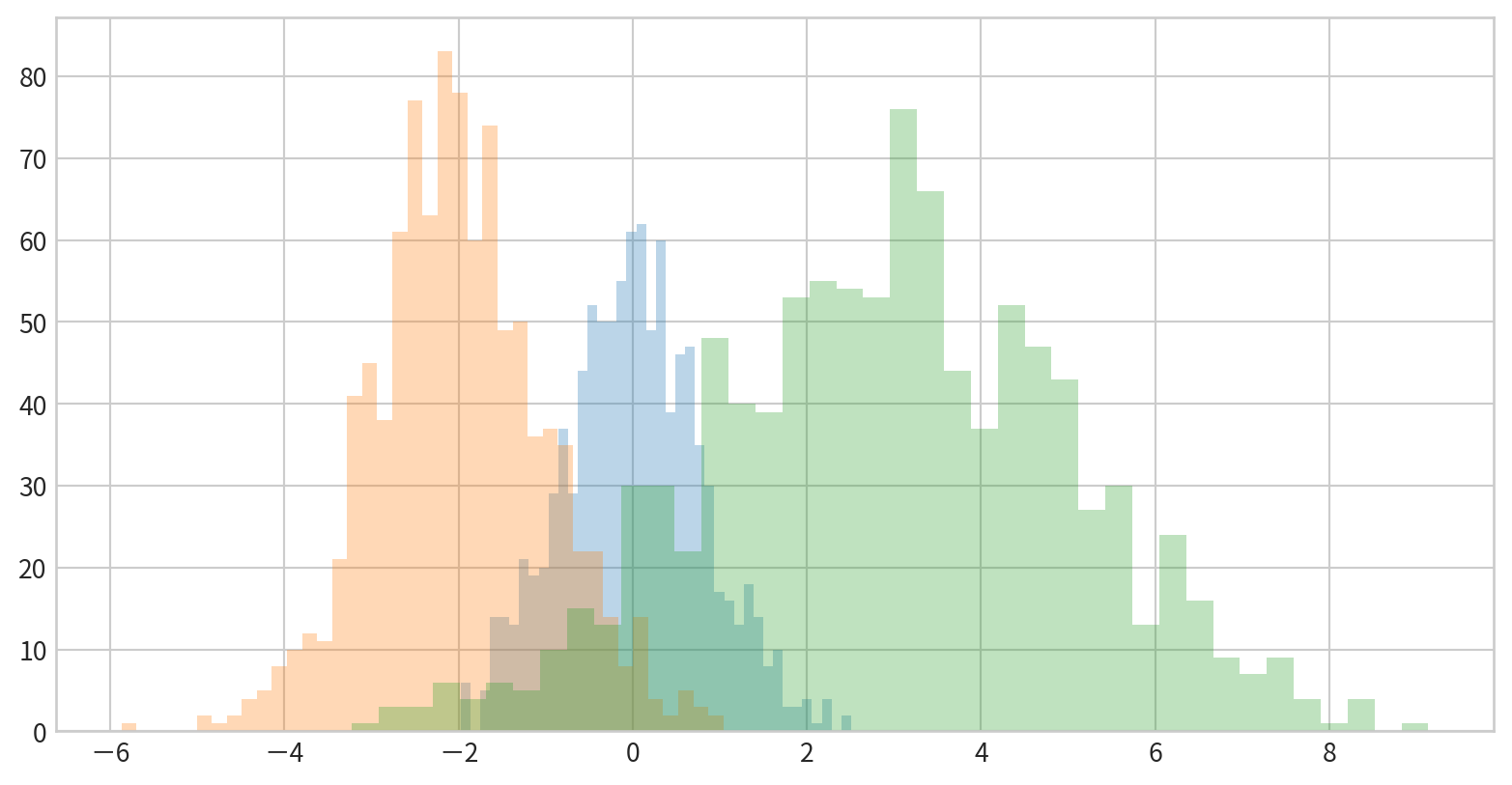
Comparing Multiple Distributions
Use dict(parameters) to set parameters
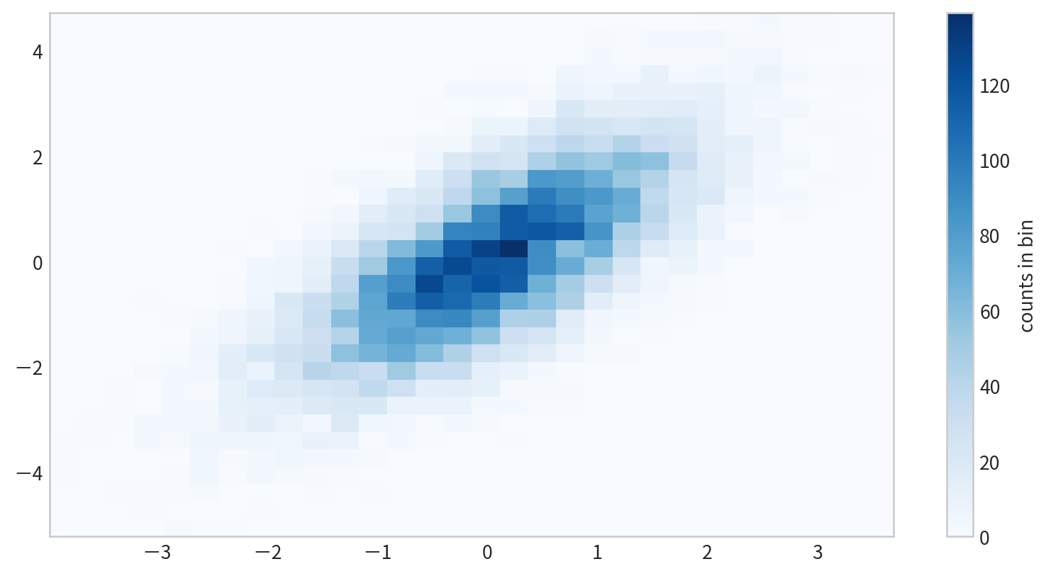
Two-Dimensional Histograms
plt.hist2d(x, y)
Data
Figure

Two-Dimensional Histograms
Hexagonal Binning
plt.hexbin(x,y) use hexagons for 2D binning

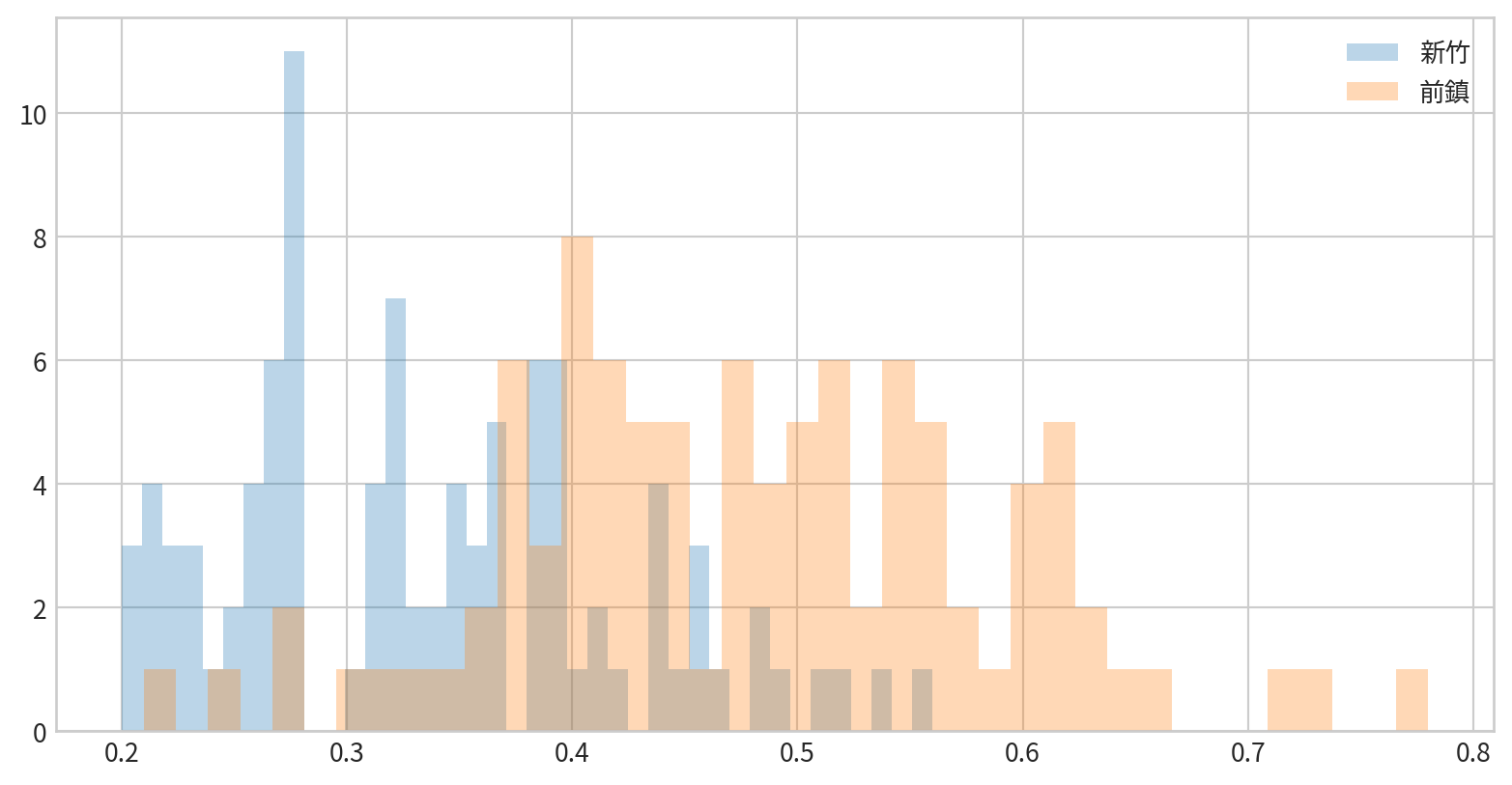
Hands-on - Histogram
看看新竹與前鎮一氧化碳(CO)的資料分布是否有差異(疊在一張圖中)
Creating a Simple Legend
x = np.linspace(0, 10, 1000)
fig = plt.figure()
plt.plot(x, np.sin(x), '-b', label='Sine')
plt.plot(x, np.cos(x), '--r', label='Cosine')
plt.axis('equal')
plt.legend()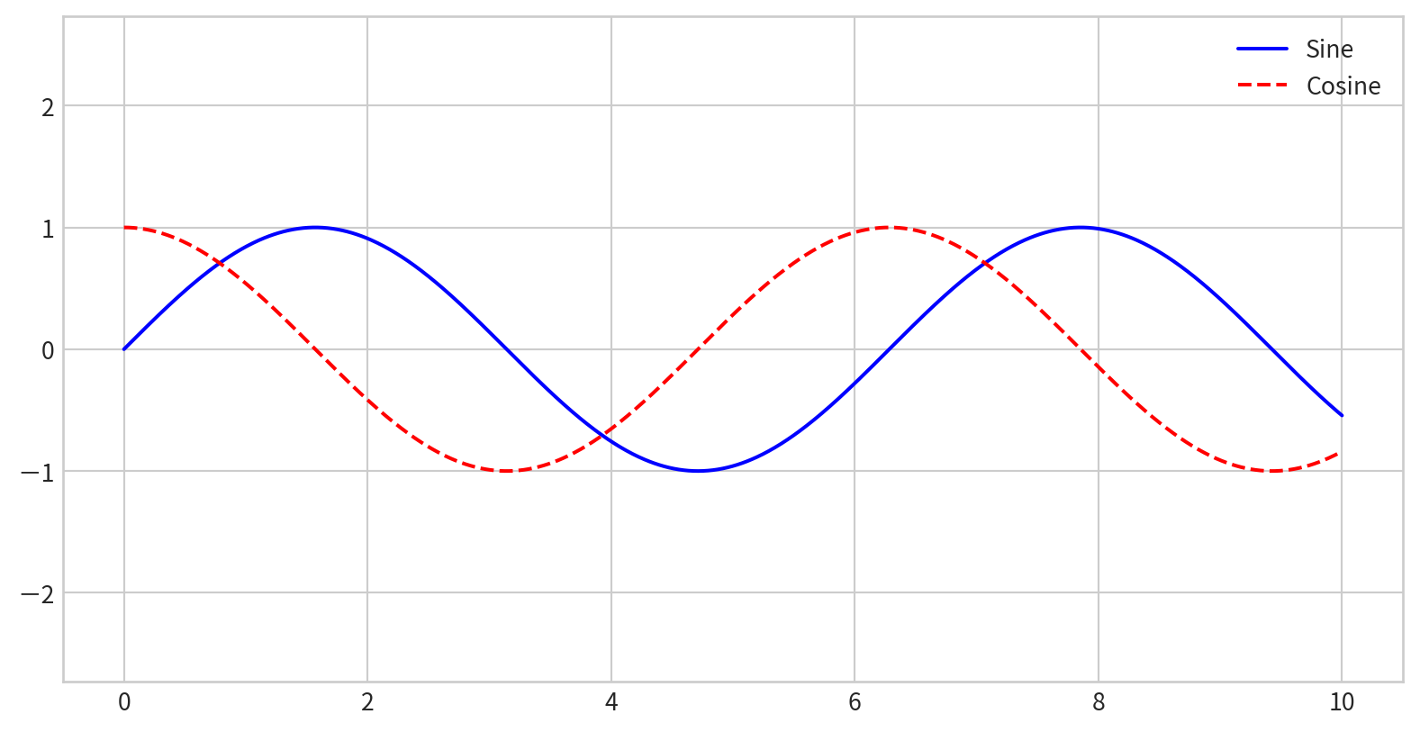
- By default, all labeled elements are included in the legend
Legend Placement and Appearance
For more options, see the plt.legend docstring.
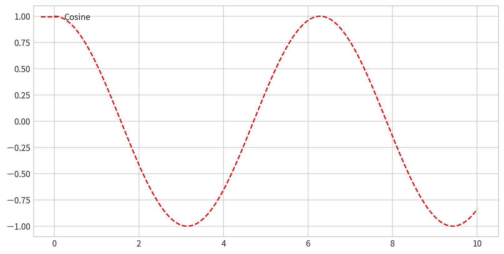
Legend Placement and Appearance
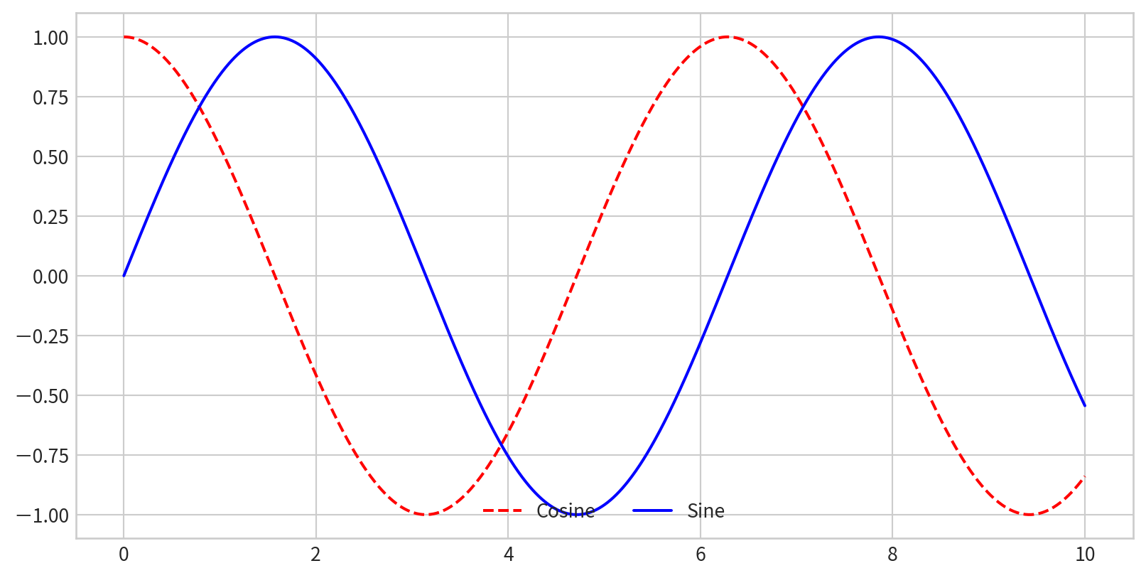
Choosing Elements for the Legend
To control which elements appear, pass specific plot objects and labels to legend()

Choosing Elements for the Legend
Or only label the elements you want in the legend
Creating a Basic Colorbar
Add plt.colorbar() after using color mapping:
Customizing Colormaps
Specify a colormap with the cmap argument (check plt.cm namespace (e.g., plt.cm.viridis, plt.cm.RdBu))
Setting Color Limits and Extensions
- Manually set color limits with
plt.clim()(to focus on a specific data range) - Indicate out-of-bounds values using the
extendinplt.colorbar()

Setting Color Limits and Extensions
Discrete Colorbars
Represent discrete values: plt.cm.get_cmap() with number of bins
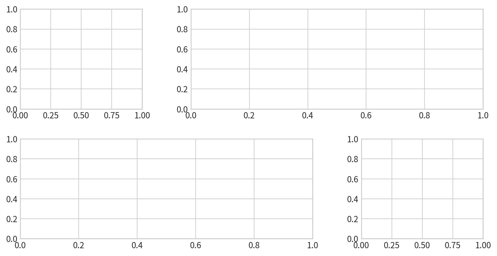
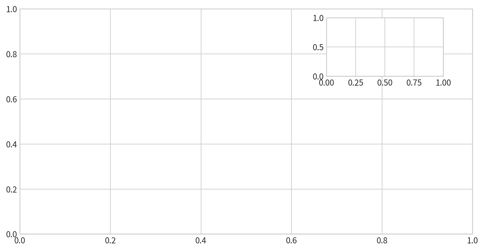
1. Manual Placement with plt.axes
Create axes anywhere in the figure by specifying [left, bottom, width, height] in figure coordinates (0 to 1).
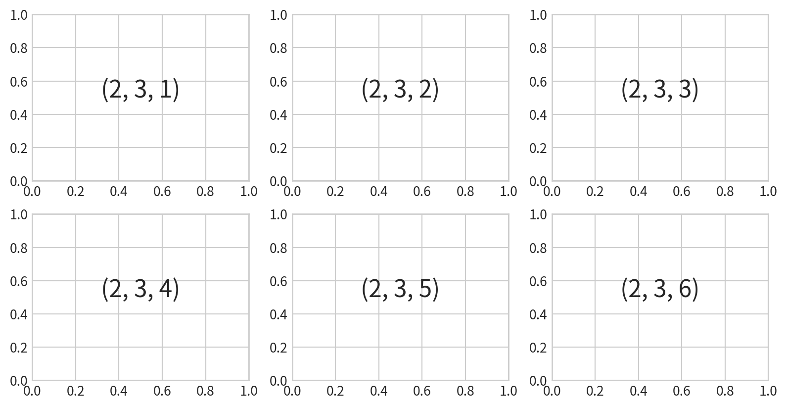
2. Simple Grids with plt.subplot
Create a grid of subplots by specifying rows, columns, and plot index (starts at 1, goes left-to-right, top-to-bottom). plt.subplot(row, col, plot index)
3. Flexible Layouts with plt.GridSpec
For more complex arrangements